We’re happy to announce today the official launching of our new interface on the Affiliate side of the world. We launched the Merchant side a few months ago and are very happy with the results, so we are hoping for more of the same on the Affiliate side.
A couple of major changes, and a lot of cosmetic changes…
Menu Changes
You’ll see a totally restructured menu which will not only give you a much more pleasant screen to look at, but will also hopefully make more sense from an organizational standpoint. Along with the menus at the top, we’ve also organized the menus on the side with 3 simple choices… “Things to Do” (join, link, create), “Things to Read” (reports) and “Things to Manage” (account settings and such).

What Are Baskets?
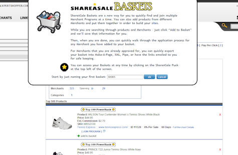
For a long time, Affiliates have been looking for a better way to search through the various products available – not just the Merchants. We’ve added the concept of the “Basket” which allows you to search not only by product, but then add those products to your Basket and use the Basket to
a) apply to multiple programs
b) export the Basket links to Email, .csv, or Make-A-Page

Take a look at the Webinars we have scheduled, and make sure to get the grand tour from Jason Rubacky, Affiliate Development Manager, sometime this week.

 MK (Casey) van Bronkhorst says
June 1, 2011 at 8:43 pmWhen you said “baskets” and I got all sorts of smiling – I thought that meant we’d be able to drag menu items into those left-hand menu baskets with our choice of options from the top menus. Any chance of that happening?
 J A Tucker says
June 2, 2011 at 9:24 amHello there to Shareasale!
Your new Affiliate interface is awesome. I have enjoyed your new options for accessing banners and marketing materials since you launched that a few months ago, but this new reporting and affiliate management interface is outta sight! Very space age, but easy to use. Keep up the tremendous upgrades and changes. Make everything easy-breezy. Thanks from The Holiday Shop stores.
 Penny says
June 2, 2011 at 11:29 amI really like the improvements to reporting.
 free key logger says
June 4, 2011 at 3:57 amShareasale is always very professional and close to the customer in providing services. Well done.
 Free Calls Hub says
June 8, 2011 at 6:22 amKudos to shareasale for the great new interface.
 bokjae says
June 10, 2011 at 4:00 amIt is indeed fantaastic! Navigation is very easy! Kudos!
 P.J. says
June 15, 2011 at 11:34 amPlease get rid of all the Flash – doesn’t work on smartphones
 Alex says
June 21, 2011 at 7:23 amI’m really, really, really excited!
The new interface is much better and convenient.
Thanks!
 Alex says
June 21, 2011 at 9:24 pmHi Folks,
I, too, like the new interface.
One request: can we customize the definition of a “day” by defining our own time zones?
Right now, the Day-At-A-Glance is based on Central Time (I believe). My Google adwords account is on Pacific Time. It would be nice to be able to quickly eyeball the two to make sure that the clicks I am getting charged for by Google are actually registering on my Share-A-Sale account.
Thanks for considering the request!
AP
 Baju Wanita says
June 22, 2011 at 12:08 amIt looks good. Keep improving and thanks for the hard work!
 Sumu says
June 22, 2011 at 8:51 amThe awesome. At first I thought what is doing ShareASale the previous platform was far better, but when I started jumping on the menu one by one, I was stunned really. Specially the left-handed menus and the statistics. Thanks Brian.
This is called the Professionalism.
 John D says
June 29, 2011 at 12:15 pmGood Stuff !
Thank you
 christa joe says
June 30, 2011 at 12:36 amreally..very good and new…
very excited to use this..new interface…really nice and simple!!
 Virtual Tour says
July 5, 2011 at 12:18 pmI really like the new interface compared with the old one. Takes a bit of getting used to it but looks a lot more web 2.0ish!
 Big Joe says
July 8, 2011 at 11:21 pmLove the improvements, and the baskets make it a lot easier to link to products.
 Abhishek says
August 19, 2012 at 9:46 ami really like the improvements made by ShareAsale and the new look is awesome in compared to the older one….