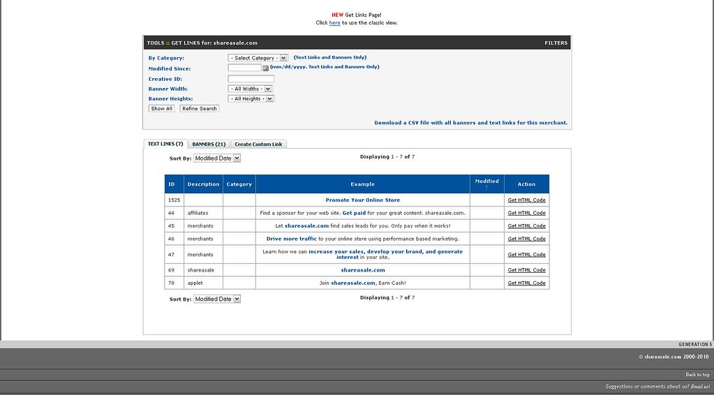
Happy Friday Everyone – we have added a new timesaver to the Affiliate Interface!
Now when you log into the interface and go to the “Get a Link/Banner” section and select a merchant you will now see the following page:

The new “Get Links” Page redesign has some added functionality to make your search for links easier!
Tabs: The page now has tabs available for you to easily navigate from text links, banners, videos, the datafeed (if available) and even to create a custom link.
Filters: You can now filter your search in a number of different ways including: Category, Modified Date, Creative ID, Banner width and height.
Sort By: Now you have the ability to sort your results by Modified Date, Banner ID, Description and Category.
Enjoy!
UPDATE We have now added an additional drop down to allow you to jump from merchant to merchant easily and have also added “number of results” which will allows for you to choose 25, 50 and “all” instead of only showing 8 results per page.

 Anthony says
September 17, 2010 at 9:31 pmYour new get links page is awesome. Everything I need in one place and just a mouse click away. I especially like the accessibility to html links for coupons and promotions.
I’m really impressed with the work that SAS has done with this.
In my opinion SAS has now moved into the lead position of any affiliate network’s linking management area.
 Wade Tonkin says
September 24, 2010 at 1:28 pmSolid stuff ShareASale! You’re doing a great job at turning this area into a strength.
 DanaMite says
October 29, 2010 at 12:06 amI would like to launch a campaign to educate ShareASale merchants on banner design, standard sizes, and the availability of choice. Most of my merchant have hideous looking graphics, very outdated looking, limited sizes. Very unprofessional looking overall & it’s a wonder they expect any click thrus. Been w/ ShareASale for 4 years & have yet to produce a sale. How can we get our ‘begging for banners’ voice heard?
 JJNW says
November 1, 2010 at 4:42 pmHi – I have to agree. Some are just ugly, out-of-season, way too small or way too huge. I just don’t have time to contact each person to have custom banners made.
I also will not place an add with a dot.Com url address showing. Why would anyone click if they see the name of the online store?
Better graphics and medium sized horizontal banners are what I need.
Also Begging for Banners!
(and better searches)
 Sarah Beeskow says
November 1, 2010 at 5:51 pmHi DanaMite & JJNW,
I’m Sarah, the manager of merchant development at ShareASale. Each month we send out educational newsletters for our merchants and we also offer monthly training webinars. We do have an advanced topic webinar for merchants that are focused on Managing Creative Inventory. But I would be happy to do another focus on creative best practices for an upcoming newsletter. Shoot me an email – Sarah(at)ShareASale.com; I’d love to bounce a few ideas off you.