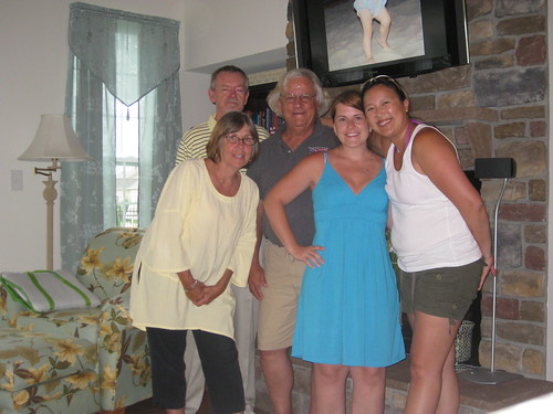
The ShareASale blog has been around for a long time, but I’m pleased to say that this is probably the first blog post written on a ferry. I am on Day 7 of the ShareASale RoadShow, and still going strong. Met up with two ABWebbers (http://www.abestweb.com) in Ocean City, MD today, for a true Maryland-style gettogether. Our host, Beachy (@beachy) and his incredible family, served up unbelievably tender crab, the sweetest sweet corn I’ve ever tasted, pulled pork, ribs, cole slaw, potato salad, local candies, cookies…it was most certainly a feast. Plus, I was in dire need of a family style meal, and let me tell ya…nothing beats learning how to take a mallet and a knife to Maryland crab, while standing at a kitchen counter. A million thanks to Mr and Mrs Beachy, and Beachy Beans too!
It just goes to show, that generosity is a defining aspect of the affiliate industry. When you stop to think about it, there’s a lot of knowledge sharing going on. Folks sharing solutions, comparing notes and best practices, and offering advice and constructive criticism for no reason other than to help others. There is a prevailence sense of co-opetition.
Today, Beachy provided some sound SEO advice, that I knew in theory, but it never really struck home until he walked us through the exercise. The site in question was built using a WordPress template. These templates have significantly simplified content management, and the popularity of these easy to use site builders is growing. The site we were reviewing had a header at the top, an “About Us” box on the left, and content in the center. The navigation menu was also on the left underneath the “About Us” box.
I thought it looked great. Lots of great, unique content; clean navigation; and thoughtfully placed, relevant ads. Beachy, however, pointed out that what we saw was not what the search engines saw. While viewing the site in Firefox, he selected “View/Page Style/No Style.” This easy trick stripped out all the graphical elements from the page, leaving only what a search engine spider would see, in the order it would see it. As it was, the “About Us” box, which was built into the template and appeared on every page, held a prominent position at the very top of every single page on the site. So no matter what the page featured, or what it focused on, since the first significant block of copy was very general, the page would not receive maximum SEO benefit.
As such, Beachy recommended moving the “About Us” box to the bottom of the page, where it would show up last, and replacing it with a banner ad. Since the banner is graphical, the spider would skip over it, and eat up the extensive product specific content below, thus giving the page better SEO qualities.
Such a simple fix, and one that anyone can do! Anyway, keep in mind, that knowledge is karmic, keep sharing it. :)


 Warner Carter says
November 5, 2009 at 9:28 pmusefull seo tweak, thanks