1. Make it YOU-nique
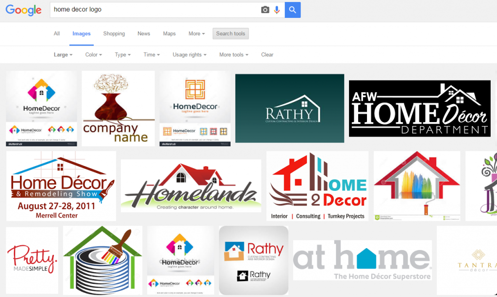
Your logo should be a direct reflection of you and what your company stands for. It should also distinguish you from competitors. Put your logo idea to the “Google Test”: enter your search terms as “[your industry] + logo” and see what the first page of image results look like. For example, if you are a home decor company and enter “home decor logo” as your search term, you will likely see a whole lot of generic logos with house motifs, pointed roofs or window-pane elements. Think about what differentiates your home decor company or blog from all the rest and focus on pulling in those elements as part of your design concept. It is always the brands that can distill big concepts down to their most simplistic -almost abstract- form that makes the biggest impact.

Take ShareASale Merchant Wayfair for example. The home furnishings and décor e-retailer uses color, a bold font and a small icon to visually represent their company. Though simple, we can break it down further:
Color: Purple is often associated with luxury, ambition, imagination and mystery. It also stands for creativity, individuality, and originality. This fits perfectly for a retail destination featuring “a zillion things” home and whose mission it is to help people curate their own interpretation of “home” that is uniquely you.
Font: An abrupt slab serif font is used as a mark of distinction.
Icon: While Wayfair is undoubtedly a home décor company, they chose to emphasize the ecommerce aspect of their business with a graphical element. They chose to replace the tittle (the little dot over a lowercase “i” or “j) with an abstract geometric shape that resembles a box to signify the key aspect of their business model: low-threshold free shipping.
There is an added bonus in the mind of the consumer when they discover something clever lying beneath the two-dimensional surface of a logo. Take the FedEx logo for example. Once you are “let in on the secret” of the white arrow, you can’t unsee it. Every time a truck goes by or a box lands on your feet, you take an extra moment to acknowledge the secret message sent to you on behalf of the brand. This tiny micro-moment helps to build a connection between the consumer and company.
ShareASale Merchant, CustomInk.com, is another logo that utilizes white space to highlight a double meaning. The octopus, an animal that naturally produces ink, has tentacles created by the negative space that is carved out by the carefully placed ink droplets.
2. Typography
Most logos feature at least one text component. For some, type may be the only component. Choosing the right font requires a thorough understanding of the historical usage, and deep-seated associations that people tend to make with certain styles. All fonts carry a personality that can either complement and support your brand or contradict it. In a nutshell, Serif fonts tend to look more serious and traditional and can sometimes connote a sense of trust, quality and authenticity. Sans-serif often give a more modern, sleek and playful feel.
Logos deserve a little more customization than your typical string of text, which may include adjusting the kerning (adjustment of spacing between letters) for single-word logos and tracking (adjustment of space between groups of letters) for multi-word logos. This can also have a profound effect on the overall mood of a font. For example, adjusting the kerning of a sans serif font so that the type is spread out can give it a boutique-y, upscale feel.

3. Versatility
In today’s multimedia world, you have to think holistically about where this logo will be featured and what it will be used for. Logo placement of the past may have been somewhat limited to things like business cards, letterhead and branded merchandise. Now we have app icons, social media profiles and banner ads – to name a few! For anyone who has tried to cram a long, rectangular text logo into a thumbnail icon, you know how frustrating it can be to have a singular and inflexible version of your logo to work with.

This is not new to logo development but another sign of a successful logo is the ability for it to scale from big to super small without losing too much of its “design” and identity. Practical questions to ask yourself are, “How does this work in a single color?” “Black and white?” “Does this still read clearly when you size it down to fit on a penny?”

If none of these things make sense to you, that’s ok! These online resources are all ShareASale Merchants. Check them out as a customer, or, if you are a blogger or Affiliate in the design + businesses vertical, sign up for their programs and promote them on your site:


